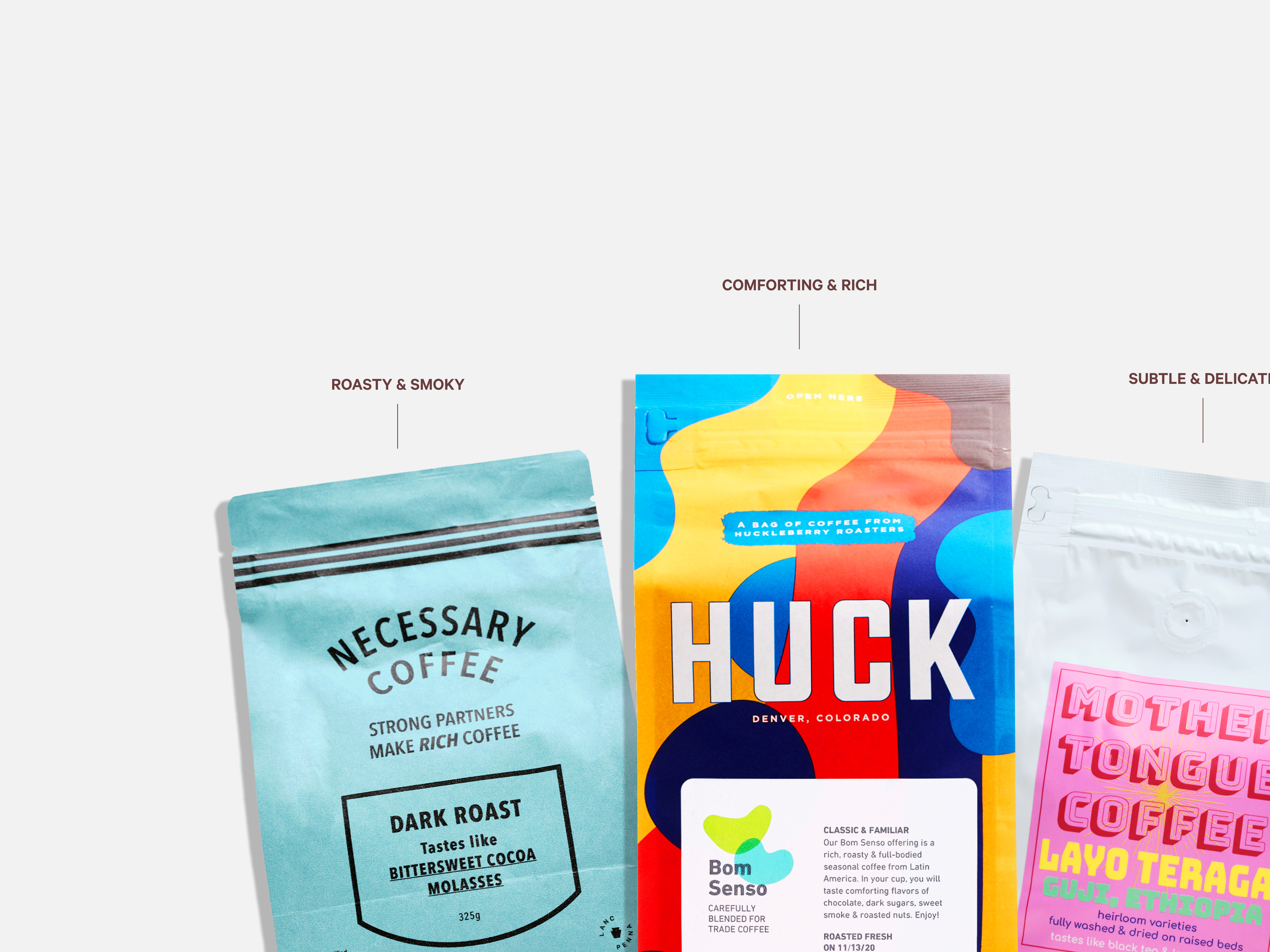
Trade is a coffee subscription service that matches your coffee preferences with more than 400 coffee brands and roasters to create a curated selection of beans. Take a quiz with questions about how you like your coffee to get matches that fit your ideal profile.
The project
As the sole product designer for the New User Squad, I led the end-to-end redesign of the coffee recommendation page, vital for onboarding new subscribers. This involved user research, usability testing, and quality assurance to ensure a seamless experience.
The goals
Increase conversion rates with a concise section above the fold for coffee recommendations and subscription benefits. Enhance user engagement through an elegant and intuitive UI, encouraging seamless scrolling to learn about the brand and subscription process.
The outcome
1. Concise Explanation of Coffee Selection: The coffee director collaborated with the data team to provide easy-to-understand information above the fold, explaining why specific coffees are chosen based on quiz answers and ratings.
2. Compelling Roaster Stories: Each image is meticulously selected to connect users with a roaster's story and mission, ensuring the highest conversion rate through testing.
3. Multiple Recommended Coffees: Users are presented with more than one recommended coffee, building excitement by offering a preview of the coffee queue upon subscription.
4. How It Works Section: A comprehensive overview includes details on customizable plans, a subscriber dashboard showcasing upcoming coffees, and future recommendations based on past order ratings.
The Issue at Hand
Approximately 70% of qualified shoppers were dropping off our funnel from the old recommendation page. Despite completing the quiz, they were not engaging with our recommendations.
What are people saying?
User feedback on the old recommendation page.
”I didn't feel like there were enough options to choose from after answering the questionnaire; I feel straight-jacketed at this point.”
User Test Participant
“I'm not sure I like answering a couple of questions and letting you pick my coffee selection. I would rather see coffee selections with notes and make my selections.”
user who did not convert
“I really like your mission and I like that you support so many local craft roasters!”
new subscriber
“I don't think that I have enough information on the brand and the company, I would be going to Google that brand quite a bit to see just more information on them before purchasing.”
User Test Participant
“I think to highlight that this isn't the only coffee for you, that there's more that you will get in 2 weeks, that might increase my excitement to try different coffee as opposed to just "Here's the coffee we got for you.”
User Test Participant
User research
In the discovery phase, our team conducted usability tests, reviewed barrier analyses, and analyzed Net Promoter Score (NPS) comments to pinpoint pain points on the existing recommendation page. We gathered feedback from users unfamiliar with Trade, those who completed the quiz but left the recommendation page, and existing customers who successfully converted.
What users want
Competitive research
Key Inspiration from Recommendation Features:
Design Studio
The objective of the design studio was to identify common themes generated by our internal teams (CX, Engineering, Data, and Marketing) to enhance recommendations for users. Here are the key highlights detailing how we transformed rough sketches into two main concepts.
VERSION A: Variety-Focused
Recommended coffee lineup: Scrollable queue, More recommendations, Percent likes & ratings
VERSION B: Roaster-Focused
Roaster image, Roaster story, More recommendations, Why coffee is a good match
A/B/C tests
Over two weeks, we conducted a series of tests to determine which concept had the highest predicted lifetime value (PLTV). Furthermore, our project manager explored whether skipping the recommendation page would result in a higher conversion rate.
Sales data revealed that Version 2, which focused on roasters, boasted the highest PLTV, surpassing Version A by 14.23%.
Sales data revealed that Version 2, which focused on roasters, boasted the highest PLTV, surpassing Version A by 14.23%.
How did we do?
Within one week of launching the new recommendation page, we observed a 43% increase in the conversion rate. Additionally, the customer lifetime value (LTV) rose by 10% per customer.
See it in action
Next steps
An essential follow-up project involves roaster asset management, enabling roasters to upload content via the upcoming self-service roaster dashboard.
Another impactful initiative will be to streamline the onboarding process by integrating the ability to customize and purchase subscriptions directly on the recommendation page. This includes eliminating the plan page to reduce the number of steps to checkout.


