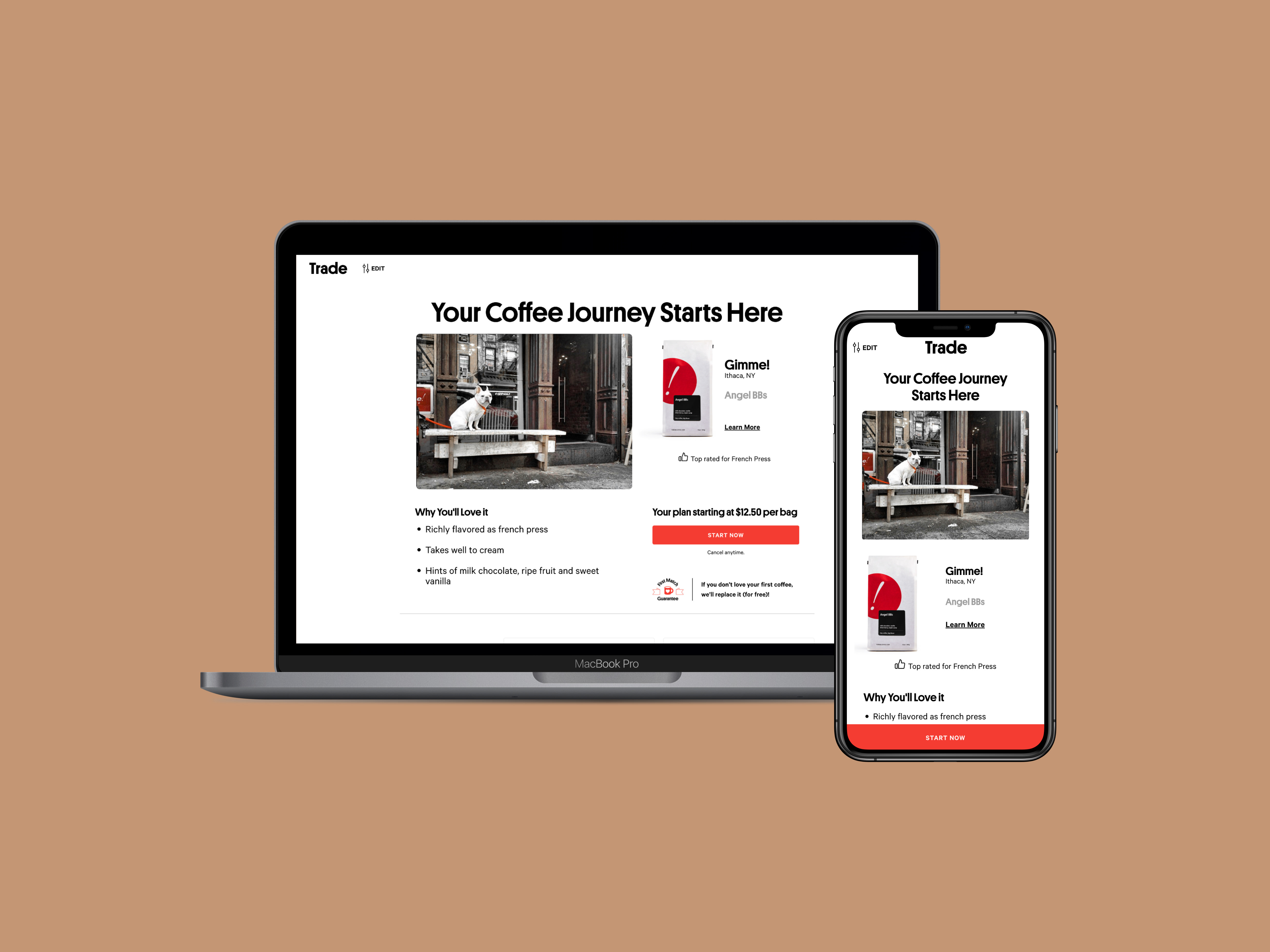
Trade is a coffee subscription service that matches your coffee preferences with more than 400 coffee brands and roasters to create a curated selection of beans.
The project
There are only two ways to subscribe: by taking the quiz or by visiting the PDP (through Google search or coming to our website.) We want to explore additional ways to show our subscription plans, perks, and memorable experiences.
The goals
Attract more users to subscribe. To avoid bouncing, give subscriptions more visibility throughout the website. Giving users more reasons to trust our service and try our coffee risk-free.
Existing Hurdles
The quiz has historically had a high engagement rate, and our redesign recommendation page is also showing a higher engagement rate.
However, more than 70% of new users land on the product description pages, and our current design doesn’t do a good job explaining the benefits of the subscription.
/browse-all-coffee page contains one page full of text links that do not help an average coffee drinker find the kind of coffee to shop for.
The PLP is overwhelming and intimidating for an average coffee drinker. Filters contain jargon that most people don’t understand. The product card on the mobile is too tall.
User Research
User tests
We tirelessly ran user tests for every detail of the new pages we redesigned, from UI elements to subscription perks messaging.
Baymard Institute
We looked through Bayard’s best practices before we began designing the UI of every page.
Competitive research
We’ve gathered a lot of great examples from subscription companies and learned from their successes.
Customer experience team
Our CX team is our eyes and ears for our customers; they have expressed that first-time users have trouble browsing for coffee.
Competitive analysis
Proposed Solutions
The following concepts represent proof of concept iterations and are not final designs.
Solution 1: Browse and subscribe.
For those who prefer not to take the quiz, this page offers user-friendly tools to help you quickly and accurately find the perfect coffee.
Solution 2: Curated collections.
Another way to subscribe: is to explore collections curated by our taste profiles and attributes. Like Spotify playlists, they'll make you think we know exactly what coffee you love.
Solution 3: Quick search.
An optimized version of our current product listing page with quick links to popular categories at the top. Subscriptions are now a category, as each collection is considered a SKU.
Defining success
Faster cart addition
Users quickly find the coffee they want or discover new favorites.
Higher engagement
Increased click rates as more users interact with our content and brand.
More subscribers
Higher visibility of subscriptions and discounts encourages more people to try our service.
Higher LTV
Pre-pay plans attract customers to maintain subscriptions longer and consider additional plans.
2024 Update
In 2022, I contributed to the release of Solution 1: Coffee Landing Page. I've been eager to see if the exploratory work has been implemented on the live site. Here's what I found:


